Top 6 QR Code Design Tips: Make It Look Great AND Work Perfectly
Created on 25 June, 2025 • 5 views • 3 minutes read
Learn 6 essential tips to design QR codes that look professional and scan flawlessly. Boost branding without sacrificing performance.
Introduction
Gone are the days when QR codes had to be plain black-and-white squares. Today, they can be styled with colors, logos, and unique patterns to reflect your brand’s identity. But with creative freedom comes responsibility: a poorly designed QR code may not scan properly or might confuse users.
In this guide, you'll discover the six most effective QR code design tips that help you combine visual appeal with flawless functionality. Whether you're creating QR codes for packaging, events, ads, or business cards, these best practices will help your designs stand out—and perform.
1. Keep High Contrast Between Foreground and Background
The golden rule of QR code design is visibility. Use a dark foreground (usually the QR code itself) against a light background. Avoid light-on-light or dark-on-dark combinations, which may look great visually but reduce scan reliability.
For example, black on white works best, but navy on beige or dark gray on pastel can also perform well. If in doubt, test the scan before going live.
2. Avoid Inverting Colors
It might be tempting to make a QR code with a light foreground and a dark background, but inverted colors often confuse scanners. Some QR readers don’t interpret them correctly, especially on older devices.
If you want a dark background for design consistency, make sure the QR pattern is significantly darker and bold enough to be recognized.
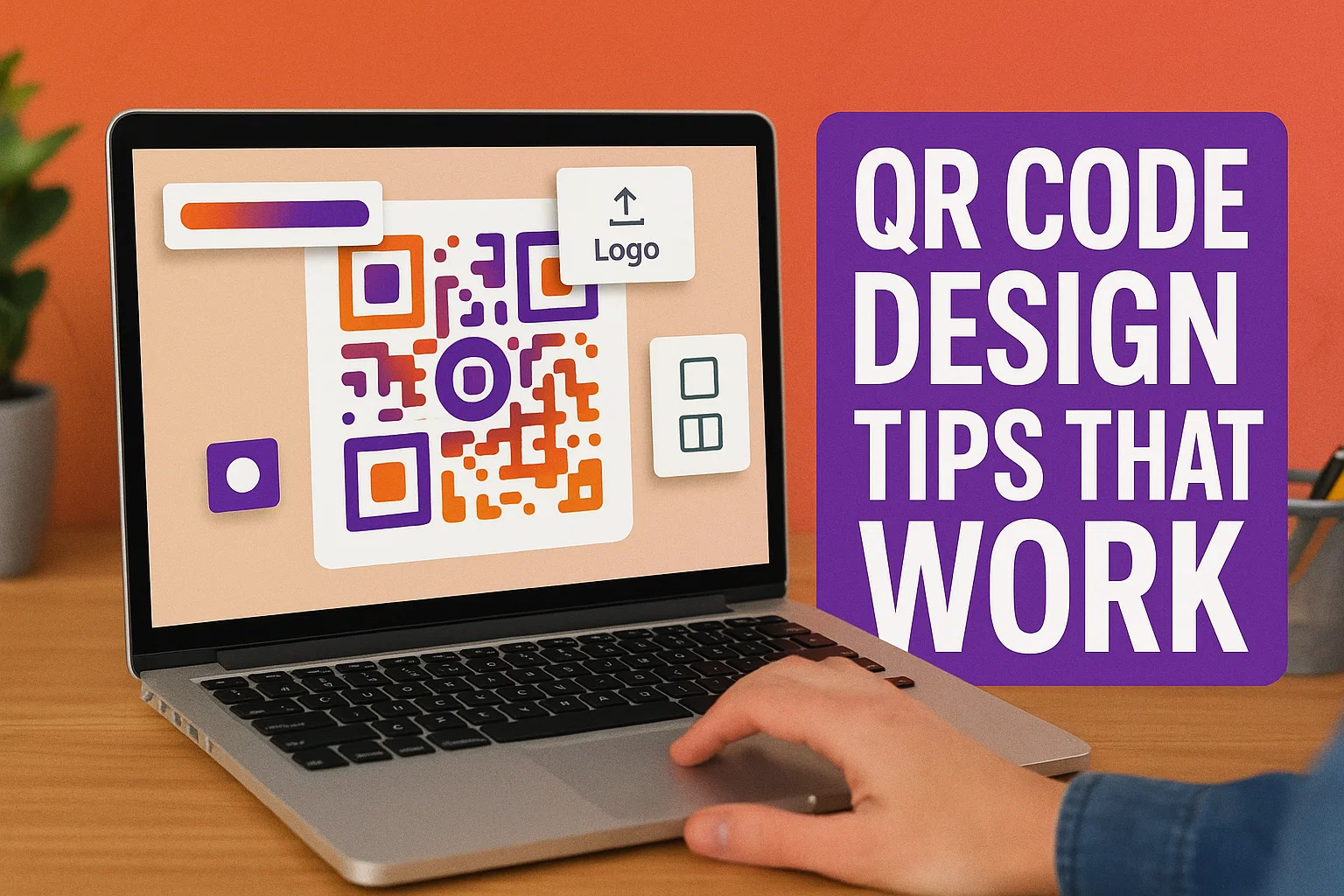
3. Add Your Logo (But Keep It Small)
One of the best ways to brand your QR code is to embed your logo in the center. Most QR generators—like VSEO.xyz—let you upload a PNG or SVG logo.
Just be careful: too large a logo can obscure important QR code data. Ideally, your logo should cover no more than 15–20% of the total area and stay within the central zone.
Bonus tip: increase the error correction level (usually to 30%) when using a logo. This helps preserve scan functionality even with some visual obstruction.
4. Use Custom Colors That Match Your Brand
QR codes don’t have to be black. Customizing the color palette is a great way to make your code feel like part of your brand. Use your brand’s primary or accent colors—just make sure to follow contrast guidelines.
Avoid gradients, which can interfere with the scan. Stick to solid colors, or very subtle gradients with clear contrast.
5. Choose the Right Corner and Eye Shapes
The corners or “eyes” of your QR code (the squares in three corners) can be styled too. Some platforms let you choose rounded, sharp, or decorative shapes.
Use styles that complement your design without being overly intricate. The scanner must still detect the position markers easily. Test your chosen shapes across multiple devices before finalizing.
6. Always Test Your Code Before Publishing
Design is nothing if it doesn’t work. Once your QR code looks great, test it rigorously:
- Try scanning it with multiple apps and devices (both iOS and Android)
- Print it in actual size to check scan distance
- Share it with team members for external validation
A beautiful but broken QR code can damage user trust and defeat your marketing goals.
Bonus: Use Vector Formats for Printing
If you're designing QR codes for packaging or posters, export them in SVG or PDF format to preserve sharpness at any size. Raster formats like PNG may pixelate when scaled up.
FAQ
Can I use a photo as a background for my QR code?
Technically yes, but it’s risky. Background images can reduce scan reliability. Use only subtle or blurred images with high contrast foregrounds.
Will a QR code still work if part of it is damaged or covered?
Yes—if you use a higher error correction level (up to 30%), the QR code can still function even if part is obscured.
How small can I make my QR code?
Minimum size depends on the scan distance. For print, 2 x 2 cm is typically the smallest you should go. For posters or signs, make it larger.
Should I use circular or rounded modules?
Rounded or styled modules are fine as long as they don’t interfere with readability. Always test before publishing.
Conclusion
Designing a QR code isn’t just about function—it’s also an opportunity to reinforce your brand visually. By following these six design tips, you can make QR codes that look great, match your brand, and scan effortlessly across all devices.
Start creating custom-designed, high-performing QR codes today at VSEO.xyz and turn simple links into powerful, beautiful brand experiences.